ShopDreamUp AI ArtDreamUp

Deviation Actions


Comments4
Join the community to add your comment. Already a deviant? Log In
I am not much of a great artist, but I will try myself on writing my first critique to you, because I see a lot of the art you do in myself and I am still trying to improve, so I will give you what I learned so far over to you, in hopes that you find it helpful.
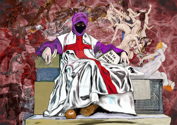
First of all I love the wings, they're detailed and colourful and I'm a sucker for that. They look like they would be really fluffy.
The overall idea is very artsy, though the media you used doesn't quite fit together in total. It's more of the background than the rest, and I had that problem as well. I know backgrounds are hard to do and very time consuming, and sometimes one gets very impatient to do these things, but believe me, if you try to at least get a general shape of the background you edited in, you'd find yourself seeing this looking much smoother than before. Even if you edit the picture in the way that you use filters to make this look less of a photograph you'd be golden until you find the patience of doing backgrounds yourself.
I am not sure which stock photo you used of faestock, but for now I assume that you used a different dress to put on her. I think the problem you have is that you see the dress, but you don't see the body beneath, so the dress looks a little too big on her hips, and her one breast is also a little too large (the left one from her perspective).
I don't know if it's just me or the skin colours are all very different, as in her head skin colour is super pale, so is her left arm and then her right arm is somewhat tan. I can also see that a lot of other shadows are missing, like on her legs and the like, so if you imagine a light bulb sitting somewhere near by her, you can envision where the light should be hitting and where a shadow is cast. For example if the only light is coming from the moon behind her, there should be a lot more shadow on the front of the viewer, and than somewhat like a contour of light going around the edges of her body.
Again I have a lot to learn myself still, but I would love to help you out more with some art critiques if you wish, just give me a message or something (Or you can come and insult me for being a shitty critic, either way is fine!) <img src="e.deviantart.net/emoticons/s/s…" width="15" height="15" alt="